While trying to find new interesting ways to visualize data, one of the methods that intrigued me is animation. Animated visualizations are fun to look at, and they are a great way to introduce data viz to a beginner or someone unfamiliar with data.
gganimate is a wonderful R package that allows a user to animate a visualization based on a variable present in the dataset. You can very easily animate one visualization at a time. But, what about animating an entire dashboard, with all the visualizations synchronized? That to me was an interesting problem, and this article is a guide on how you can create an animated dahboard similar to how the one below.
So sit back, relax and fire up RStudio!
Packages
This particular visualization requires quite a few packages to be installed and loaded. If you are unable to install a few of these libraries through the CRAN, simple search “package name github” and follow the instructions provided on the GitHub page.
library(tidyverse) ## ggplot2, dplyr, tidyr etc.
library(gganimate) ## animation
library(understatr) ## data
library(ggsoccer) ## pitch plotting
library(viridis) ## colour scales
library(magick) ## magic (lol). putting the dashboard together, actually
library(ggbraid) ## fancier line chart
library(glue) ## text stuff
Data
The data for this visualization is from Understat. We shall use the understatr package to scrape the data. We’ll also do some basic data wrangling that is common to all the vizzes in the dashboard. The player we are choosing for this viz is Mohamed Salah. However, you’re free to choose whichever player you wish, it really doesn’t matter.
data <- get_player_shots(player_id = 1250)

# Setting StatsBomb coordinates

data <- data %>%
  mutate(X = X * 120,
         Y = Y * 80)
Shot Map
Lets create a shot map. More specifically, we’ll be creating a shot heat map, which plots a density map of all the shots of Salah’s top flight career so far. We’ll also make sure to not include penalties in the dataset.
shot_data <- data %>%
  filter(!situation == "Penalty")

p1 <- ggplot() +
  annotate_pitch(dimensions = pitch_statsbomb, fill = "#151515", colour = "#454545") +
  coord_flip(xlim = c(60,120),
             ylim = c(80, -2)) +
  theme_pitch() +
  stat_density_2d(data = shot_data, aes(x = X, y = Y, fill = ..level..), geom = "polygon",
                  alpha = 0.9, show.legend = FALSE) +
  scale_fill_viridis(option = "plasma") +
  theme(plot.background = element_rect(colour = "#151515", fill = "#151515"),
        panel.background = element_rect(colour = "#151515", fill = "#151515")) +
  gganimate::transition_time(year) +
  ease_aes("circular-in")

You can very easily see where gganimate is being applied here, as I’ve explicitly pointed it out by naming it within the code. transition_time is one of the many functions that can be used to render animations using gganimate. We’ve also included a specific animation style using the ease_aes function, one that suits the heatmap style we have adopted for the viz. Feel free to play with the colours as well.
Bar Plot
Let us now create a bar plot of all the different situations Salah has scored from. We’ll use an ifelse function to assign a value of 1 to goals and 0 to all other shots. ggplot2 automatically summarises the goals for us as we plot it.
bar_data <- data %>%
  mutate(isGoal = ifelse(result == "Goal", 1, 0))

p2 <- ggplot(bar_data) +
  geom_bar(aes(x = isGoal, y = situation), stat = "identity", fill = "#3498DB", colour = "#3498DB") +
  theme(plot.background = element_rect(colour = "#151515", fill = "#151515"),
        panel.background = element_rect(colour = "#151515", fill = "#151515")) +
  theme(axis.title.x = element_text(colour = "white", face = "bold", size = 12),
        axis.title.y = element_text(colour = "white", face = "bold", size = 12),
        axis.text.x = element_text(colour = "white", size = 10),
        axis.text.y = element_text(colour = "white", size = 10)) +
  theme(panel.grid.major = element_line(colour = "#454545", size = 0.4, linetype = "dashed"),
        panel.grid.minor = element_line(colour = "#454545", size = 0.4, linetype = "dashed")) +
  theme(panel.grid.major.x = element_line(colour = "#454545", size = 0.4, linetype = "dashed"),
        panel.background = element_blank()) +
  labs(y = "Situation", x = "Goals") +
  gganimate::transition_states(year)

Not much different from the shot map here, except we’ve decided to show the gridlines in this plot. Notice how we have used a different animation function for this plot. In my opinion, transition_states shows the data presented by the bar chart in the simplest way with the least obstructions due to the moving animations.
Line Plot
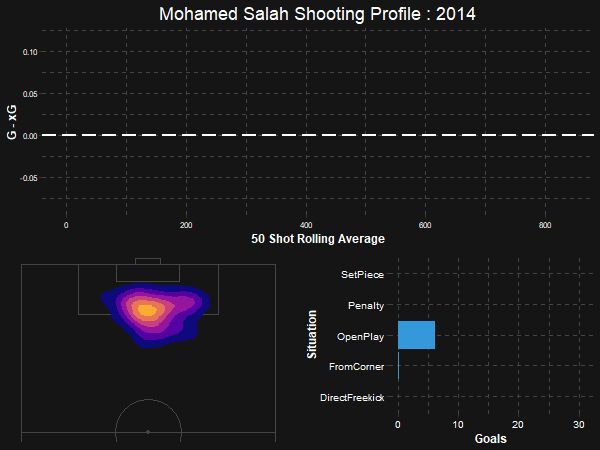
The final element of this dashboard, a line plot showing the finishing over/under performance. We’ll calculate a rolling average for the data, as well as create a column of natural numbers going up to the number of rows in the dataset, which will be our x axis.
line_data <- data %>%
  mutate(isGoal = ifelse(result == "Goal", 1, 0)) %>%
  mutate(GxG = isGoal - xG) %>%
  mutate(GxGSM = TTR::SMA(GxG, n = 50)) %>%
  mutate(index = 1:nrow(data))

p3 <- ggplot(line_data, aes(x = index, y = GxGSM)) +
  geom_line(size = 2) +
  geom_braid(aes(ymin = 0, ymax = GxGSM, fill = GxGSM > 0), show.legend = FALSE) +
  scale_fill_manual(values = c("#E74C3C", "#3498DB")) +
  geom_hline(yintercept = 0, size = 1, colour = "white", linetype = "longdash") +
  labs(title = "Mohamed Salah Shooting Profile : {round(frame_along, 0)}", x = "50 Shot Rolling Average", y = "G - xG") +
  theme(plot.background = element_rect(colour = "#151515", fill = "#151515"),
        panel.background = element_rect(colour = "#151515", fill = "#151515"),
        plot.title = element_text(colour = "white", size = 18, hjust = 0.5)) +
  theme(axis.title.x = element_text(colour = "white", face = "bold", size = 12),
        axis.title.y = element_text(colour = "white", face = "bold", size = 12),
        axis.text.x = element_text(colour = "white", size = 8),
        axis.text.y = element_text(colour = "white", size = 8)) +
  theme(panel.grid.major = element_line(colour = "#454545", size = 0.4, linetype = "dashed"),
        panel.grid.minor = element_line(colour = "#454545", size = 0.4, linetype = "dashed")) +
  theme(panel.grid.major.x = element_line(colour = "#454545", size = 0.4, linetype = "dashed"),
        panel.background = element_blank()) +
  gganimate::transition_reveal(year)

A few new things to notice here. We’re finally creating a title in this plot. This is because in the dashboard, this line plot will be at the top of the other two plots which shall be stacked side-by-side. Also we’re using a frame_along within the title of the plot, which will animate the title and change as the years change.
Yet again, we are using a different transition function for the line plot. transition_reveal is the best, and probably the only one that works for line plots.
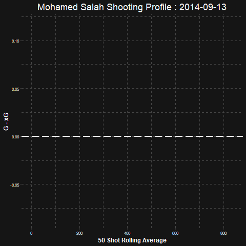
You might notice that the animation for this plot moves a bit slowly. This is as the variable used for the animation is year. You will recieve a smoother animation by using the variable date in the transition layer. However, for the sake of synchronization of the dashboard, we’ll continue with using year
Here’s what the line chart could have looked like if we used the date variable as the transition layer.
And we’re done with creating all our plots. The next part is the most interesting one, detailing the animations and getting all the plots put together in a dashboard.
Animation and Synchronization
In order to put all our plots in a dashboard, we need to set a few specifics. We will thus set the frame rate, duration, height & width as well as render the gifs as magick images so as to combine them together at a later time.
p1_gif <- animate(p1,
                  fps = 10,
                  duration = 20,
                  width = 300, height = 200,
                  renderer = magick_renderer())

p2_gif <- animate(p2,
                  fps = 10,
                  duration = 20,
                  width = 300, height = 200,
                  renderer = magick_renderer())

p3_gif <- animate(p3,
                  fps = 10,
                  duration = 20,
                  width = 600, height = 250,
                  renderer = magick_renderer())
Make sure to set the width and height wisely, as they have to be a snug fit. I found these dimensions to be perfect, but feel free to play around!
Putting it all together
The time to put together the final product is finally here! First, let us assemble the dashboard. The shot map and the bar plot go side by side (p1_gif & p2_gif). The combined image (combined) is once again put together with the line chart, this time with the argument stack put to TRUE, which stacks the images one on top of the other.
combined <- image_append(c(p1_gif[1], p2_gif[1]))
new_gif <- image_append(c(p3_gif[1], image_flatten(combined)), stack=TRUE)
The 1 next to the GIF’s stands for the first frame in the GIF. There are 200 frames in this GIF, which is a number we got from animating the vizzes in the previous code block. We set the frames per second (fps) as 10 and the duration as 20, the product of which gives us 200.
We use a for loop to run through the same code again, but this time from layers 2 through to 200, and combining all the layers into the object new_gif.
for(i in 2:200){
  combined <- image_append(c(p1_gif[i], p2_gif[i]))
  fullcombined <- image_append(c(p3_gif[i], image_flatten(combined)), stack=TRUE)
  new_gif <- c(new_gif, fullcombined)
}
Our animated dashboard is finally ready! We can go ahead and save it by running the following line.
image_write(new_gif, format = "gif", path = "animation.gif")
And we’re done! Look for the file “animation.gif” within the working directory of your system (use getwd() to find working directory).
The entire code for this visualization can be found at this link
Concluding Thoughts
In this guide we learnt about animating a plot using gganimate in R. We also learnt about the different transition types we can use as well as the different styles to augment our animations to make them better. And finally, we learnt to put together different animated plots in a synchronized dashboard.
While I would still be of the opinion that an interactive plot, or even a static plot is the best way to present data, this was a fun excercise that showed all that can be done with R. There are several different ways that can be used to reach out to the audience by the way of data and visualization, and I hope that this guide managed to convey that idea well.
Author: Harsh Krishna
We hope you enjoyed reading this article and found the concepts interesting and simple to understand. You can contact the author at his twitter account about any doubts you may have.
Thanks for reading!